The paper behind this story
Keeping Pace with Inflation
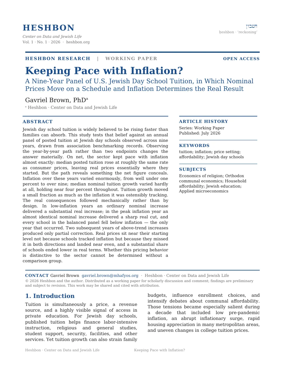
Request the full whitepaper
Tell me who you are and where you work. I’ll send the complete paper.
Sent to the author directly. No list, no forwarding, no third parties.
So we rebuilt the posted price at 165 schools across nine years, 773 school-years in all, and set each school's own annual increase against the CPI. Over the whole window the two match almost exactly. Year by year they barely touch.
An original dataset assembled by hand from school-published tuition schedules and archived captures of them, plus public filings, reconstructed across nine years (2017–18 through 2025–26). Every school is tracked against its own posted price year over year, which is what makes a within-school growth series possible over such a long window.
Every figure here rests on the posted-tuition record above, tracked within each school across the nine years.
How far did inflation move over these nine years, and how far did tuition move?
Between 2018 and 2025, annual inflation ranged from well under one percent to over nine. Median nominal tuition growth stayed between three and four and a half percent the whole time, varying about one-sixth as much as the figure it supposedly tracked.
The two cells below carry the same measurement applied to a different series: the distance in percentage points from that series' lowest year to its highest. A bigger number means a series that swung further. The pale cell is consumer prices. The dark cell is posted tuition.
Notice how much of the pale cell's number the dark cell fails to reach.
Year by year, do the two lines ever move together?
Two lines run across the chart below, one point for each school year from 2018–19 to 2024–25. The grey line is consumer price inflation, measured June to June. The dark line is the median annual increase in posted tuition, computed inside each school, so a school is only ever compared against itself.
Both lines sit on the same vertical scale, in percent, and the dashed line across the middle is zero. Higher on the page means a bigger increase. The four buttons above the chart change which line is drawn heavy; the last one adds a third line, in rust, which is the tuition increase with inflation subtracted out. The shaded rust band covers 2021–22 and 2022–23.
Watch the grey line climb and fall back while the dark line underneath it barely bends.
Anything genuinely indexed to consumer prices would have registered a swing that size. Median tuition growth held between 3.05% and 4.51% throughout, so schools applied something close to a customary annual increase rather than reading the CPI. The real price then follows by arithmetic: an ordinary nominal bump produced a +3.16% real gain in the calm year and a −5.09% real cut in the spike year. Every school in the balanced panel fell below inflation in 2021–22, the only year that happened.
Nobody wrote down the rule that tuition goes up about four percent a year. Schools follow it anyway.
Roughly four percent a year, applied through deflation scares and through the sharpest price surge in four decades. The rate barely moved either way.
Four percent of what, though?
Each square in the grid below is one state or province, set in roughly its place on the map. The shading carries the number: a square is filled with rust in proportion to the median posted tuition there, so the palest squares sit near $9k and the fully saturated ones near $34k. The small figure under each abbreviation is that median rounded to the nearest thousand. Squares left empty are states with fewer than two reporting schools.
Find the darkest square, then the palest one carrying a figure. Hover or tap any tile for the exact number.
Once the surge passed, did schools claw the real price back?
The chart below cuts the window into three stretches and gives each one a bar. The vertical line down the middle is zero, the point at which tuition rose at exactly the rate of inflation. A bar running right of that line is a stretch when the posted price gained on inflation. A bar running left is a stretch when it lost. The rust bar is the surge itself, the two slate bars the years on either side of it. Length is the median annual real change, computed inside each school.
Notice that the rust bar points the other way from the other two, and reaches further.
So: day school tuition rises about 4% a year. Does it track inflation?
Only in the total, and only by accident. Across seven years the median school ended 1.0% higher in real terms, essentially unchanged. That net reflects missing inflation in both directions and landing near even, and 41% of schools still finished lower in real terms than where they started.
A school that indexed its price to the CPI would have raised tuition by nine percent in one year and by well under one percent in another. None of them did. They raised it by roughly four, every year, and let the arithmetic fall where it fell.
This panel contains only Jewish day schools. Whether repricing at a near-fixed nominal rate is distinctive to the sector or common to independent schools generally cannot be determined here.
Cumulative change rests on schools present in every year. The 557 consecutive-year pairs corroborate the pattern, though the seven-year magnitude should be read with that sample in view.
These are sticker prices before aid. Real-price stability does not establish affordability.
Schools that post a public tuition schedule and leave an archived trail skew larger and more established, so the Chassidic and yeshiva sector is under-represented here.
The paper behind this story
Tell me who you are and where you work. I’ll send the complete paper.
Sent to the author directly. No list, no forwarding, no third parties.
A data project on how Jewish life is paid for. The work comes in seasons. This page is part of Season 1 — Jewish Education. It states its own sources, sample sizes and limits.
Ahead: Season 2 — Household Affordability · Season 3 — Federation & Charitable Giving
Working prototype. Every figure comes from the underlying research. Where a chart simplifies a published result, the page says so. Nothing here audits an individual school.