Revenue at these schools grew about 8% a year. Did executive pay follow?
Nonprofit pay theory expects compensation to follow the size and growth of an institution. So we read every Schedule J compensation line out of 1,165 public Form 990 e-filings, one school at a time, and set what 140 Jewish day schools paid their top earner against what those schools took in. Across these schools the pattern runs backward: the ones whose revenue climbed fastest are the ones whose executive pay climbed slowest.
Two bars below, both measuring one year of growth at Orthodox and Chareidi schools. The brass bar is institutional revenue. The rust bar is what the top earner was paid. Both bars start at the same point and sit on the same pale track, so the one that fills more of its track grew faster, and the rate is printed underneath it. Watch how little of its track the rust bar fills.
Revenue, the brass bar, runs to 7.7–8.4% a year, the fastest of any denominational group in the study. Executive pay, the rust bar under it, stops at 0.75–1.25%, the slowest of any group.
0schools
0school-year records
0in growth panel
2017–24filing years
Scroll
How this dataset was built
An original dataset assembled by hand from public IRS Form 990 filings, historical and archived filings, Internet Archive / Wayback captures, and school and public web sources, reconstructed across eight filing years (2017–24). Every Schedule J, Part II compensation line was read out of the raw 990 e-filings one school at a time, then stitched into a multi-year panel so the same institution could be followed as its pay and revenue moved.
IRS Form 990 filings (bulk XML archive)Historical & archived filingsInternet Archive / WaybackSchool & public web sources
1,165Form 990 e-filings parsed
579school-year records
140schools
124schools in the growth panel
Public labor-market indices (BLS Consumer Price Index and Employment Cost Index, via FRED) are used only as benchmarks; the findings rest on the assembled 990 record above.
The short version
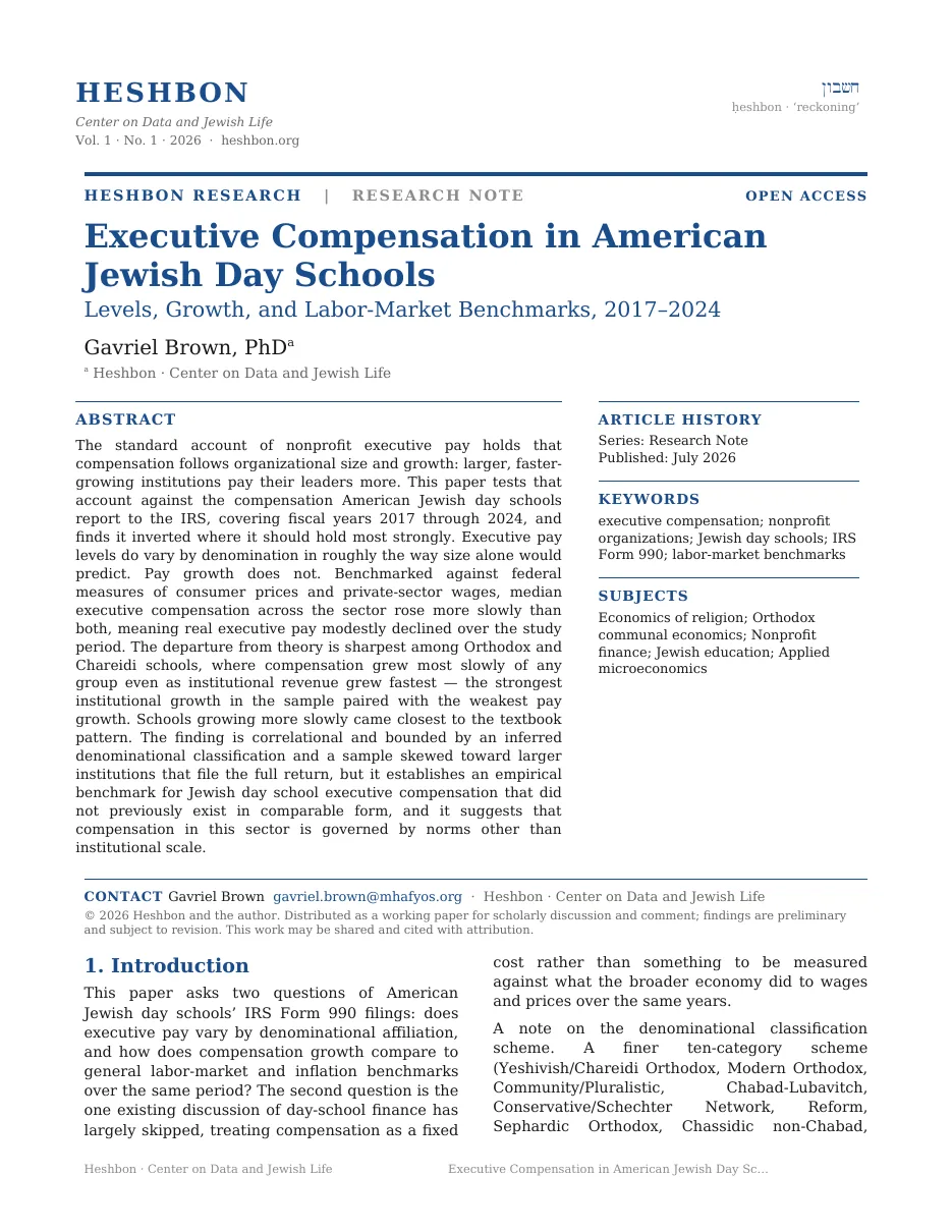
Revenue rose about 8% a year. Pay rose about 1%.
Orthodox and Chareidi schools recorded the fastest institutional revenue growth of any denominational group in the study, and the slowest growth in executive compensation.
A size-driven theory of nonprofit pay predicts the reverse. The institutions taking in more money each year should be the ones raising the top salary fastest. Here they are the ones raising it slowest.
0
Revenue growth a year at Orthodox and Chareidi schools (7.7–8.4%), the fastest of any group.
0
Executive compensation growth at those same schools (0.75–1.25%), the slowest of any group.
Something other than institutional size is setting the price of leadership in these schools.
01 · The benchmarks
Pay grew slower than prices, and slowest where revenue grew fastest.
Did executive pay at least keep up with prices, or with what other employers were paying?
Two outside yardsticks answer that. Consumer prices rose 3.71% a year over the study window, which tells us whether a salary held its purchasing power. Private-sector wages rose 3.88% a year, which tells us whether it kept pace with what employers generally were paying for labor.
Median executive compensation grew 2.9% to 3.2% a year, landing below both marks, so inflation-adjusted executive pay slipped over the seven years. At Orthodox and Chareidi schools the gap widened further: compensation there grew about 1% a year while revenue at the same schools grew close to 8%.
Each row in the chart below is one annual growth rate, and every bar runs rightward from zero, so a longer bar means faster growth. The two slate bars at the top are the outside yardsticks. The two rust bars beneath them are executive pay, and the bottom one, Orthodox and Chareidi schools, is drawn darker with its name set in rust because it is the row to watch. The three buttons above the chart change the view. Against inflation subtracts the 3.71% inflation rate from each rate and draws a vertical line at zero, so a bar running left of that line means pay lost purchasing power. By denomination drops the yardsticks and puts revenue growth, in brass, above pay growth.
Notice that neither rust bar reaches either slate one.
Compensation growth against the benchmarks
Hover or tap a bar for its exact figure.
Start at the top. Private wages sit at 3.88% a year, consumer prices just under at 3.71%. Drop one row to executive pay across all schools and the bar stops at 2.9–3.2%. Drop one more, to Orthodox and Chareidi schools, and it stops at 0.75–1.25%. Now press Against inflation: private wages hold at +0.17%, pay at all schools crosses to the left of the zero line at -0.66%, and the Orthodox and Chareidi bar runs out to -2.71%, meaning a top salary there bought about 2.71% less each year than it had the year before. Communal schools, which grew more slowly, came closest to the textbook pattern where pay tracks size.
02 · Levels versus growth
On levels alone, the numbers look ordinary.
If the growth rates are strange, are the salaries themselves strange too?
They are not, and this is the strongest thing that can be said for the conventional account. Median top-earner compensation ranges from about $193,000 at Orthodox and Chareidi schools to roughly $243,000 at Communal and Modern Orthodox schools. Larger institutions pay more, which is exactly what the size story predicts.
The theory holds for levels and breaks for growth. Pay levels track institutional size in the expected direction, while pay growth moves against institutional growth. Whatever governs compensation here is doing something other than scaling with expansion.
$0
Modern Orthodox, median top-earner compensation.
$0
Communal, median top-earner compensation.
$0
Orthodox and Chareidi, median top-earner compensation.
Three rows below, one for each denominational group, each bar running rightward from zero on a dollar scale, so a longer bar is a higher median salary. Modern Orthodox is the brass bar at the top, Communal the slate bar in the middle, Orthodox and Chareidi the rust bar at the bottom. The second button, The gap, redraws the same three rows as the distance each median sits below the highest of them.
Look at how little daylight there is between the top two bars.
Median top-earner compensation by denomination
Hover or tap a bar for its exact figure.
The brass bar at the top, Modern Orthodox, reaches $243,166. The slate bar under it, Communal, reaches $242,107, which is $1,059 less and the width of a pencil line on this scale. The rust bar at the bottom, Orthodox and Chareidi, stops at $193,338. Press The gap and the first two rows almost disappear while the bottom row runs out to $49,828 below the highest median.
Something other than size is setting the price of leadership here.
The data does not say what. Communal expectation, board composition, a shared sense of what a school ought to pay: each remains plausible, and none of them show up in a tax filing.
03 · From the institution's ledger
Institutions grew. The leadership line did not follow.
What does the same finding look like from the school's own books?
It looks like a shrinking line item. Median top-earner compensation, measured as a share of that year's school revenue, has fallen steadily since 2020. It stood at 2.42% in 2017 and reached 1.74% by 2023.
Revenue expanded while the pay line held roughly flat, so its share of the budget shrank. Whether that reflects restraint, communal norms, or something the filings cannot reach is a question for work beyond this note.
0
Compensation as a share of revenue in 2023, down from 2.42% in 2017.
0
Of filings, 2017 through 2023, over which the share declined by nearly a third.
One rust line runs across the chart below, with a dot for each filing year from 2017 to 2023. The vertical scale is the median top salary written as a percentage of that same year's school revenue, so higher on the page means the salary took a bigger slice of the budget and lower means a smaller one. The figure at the left end of the line is where the series starts, and the figure at the right end is where it finishes.
Follow the line across and watch where it turns down.
Compensation as a share of school revenue
Median top-earner pay divided by same-year school revenue, 2017–2023.
Hover or tap a point for that year's share.
The line opens at 2.42% in 2017 and then barely moves for four years: 2.38%, 2.35%, and back up to 2.41% in 2020. Put a finger on that 2020 dot, because every dot after it sits lower than the one before. The share falls to 2.12% in 2021, to 1.87% in 2022, and to the 1.74% printed at the end of the line in 2023.
The bottom line
The salaries are ordinary. The trajectory is not.
So: revenue at these schools grew about 8% a year. Did executive pay follow?
No, and it did not keep up with consumer prices either. Median top-earner compensation across 140 schools grew 2.9% to 3.2% a year against inflation of 3.71%, and at the Orthodox and Chareidi schools, the fastest-growing group in the study, it grew about 1%.
The levels sit where a size story would put them: $243,166 at Modern Orthodox schools, $242,107 at Communal ones, $193,338 at Orthodox and Chareidi ones, largest institutions first. It is the movement that does not fit. Over seven years of filings the top salary fell from 2.42% of school revenue to 1.74%.
A board setting one of these salaries is working from something other than the size of the institution. What that something is does not appear on a Form 990, and this analysis does not claim to name it.
What this analysis cannot say
Four limits worth carrying with the finding.
Correlational
This establishes a pattern between denominational affiliation and compensation trajectory. It identifies no mechanism.
Inferred denomination
No federal filing records religious movement. Classification rests on curated lists, naming conventions and individual verification.
Large filers only
Schedule J detail exists only for schools filing the full Form 990, which omits smaller schools entirely.
Uneven year coverage
The 2024 data is too thin to report reliably, and the Other category holds too few schools to be representative.
Source & method
An original dataset assembled by hand: Schedule J, Part II compensation was read out of 1,165 full IRS Form 990 e-filings pulled from the bulk XML archive, cross-checked against historical and archived filings, Internet Archive / Wayback captures, and school and public web sources, and reconstructed across the 2017–24 filing years. The result is 579 school-year records across 140 schools, with a 124-school panel used to track growth in pay and revenue over time.
As labor-market yardsticks, the analysis uses two public government indices retrieved via FRED: the BLS Consumer Price Index (3.71% a year) and the Employment Cost Index for private-industry wages (3.88% a year).
From Executive Compensation in American Jewish Day Schools, Gavriel Brown, PhD, research note, July 2026.
◆
The paper behind this story
Executive Compensation in American Jewish Day Schools
Working paper · 2026 · Ḥeshbon · Center on Data and Jewish Life
Tell me who you are and where you work. I’ll send the complete paper.
Sent to the author directly. No list, no forwarding, no third parties.
Ḥeshbon — Center on Data and Jewish Life
A data project on how Jewish life is paid for. The work comes in seasons. This page is part of Season 1 — Jewish Education. It states its own sources, sample sizes and limits.
Working prototype. Every figure comes from the underlying research. Where a chart simplifies a published result, the page says so. Nothing here audits an individual school.